[request] "Settings menu" demo #1
Comments
|
Awesome idea! it"s really something which would useful fora lot of people! It turned out that you have designer skills. Can you create a layout design? Finally, the user only needs to apply a theme to change the default (plain) appearance. |
I have no designer skills. Only some experience to see obvious problems in design/usability, and where to take ready solutions when available. My skills are more close to "software architect" If you give me some time, i will prepare list of exact links to UI guidelines, where to read about each menu element. |
I'm not very good, but I try still to do a pencil sketch/moqup and share it. |
|
@kisvegabor give me 1 week. I'm trying to understand, what can be useable for programmers, to quickly create interface sketches from ready material components. Something like this: |
|
Tech note. https://stackblitz.com/edit/mdc-web-quick-start-demo Nice online IDE. Seems demo can be published on web. That's ~ the same as offline (node.js + webpack), but result can be seen immediately, without install. + anyone can fork & edit. * does not work in Firefox, open in Chromium/Chrome investigating... |
|
[1, 3, 4] maybe inspired us. I am using Pinterest daily and I opened a board [2] and gathering inspirational work here as I meet. What should be included in the "settings menu"? What do you think about "home automation demo" idea? 📷 Pins
📋 Reference |


I'd say, screens look nice, but there are nothing special in details. All this things are described in UI guidelines. IMO words "home automation" may sound magically, but have nothing special/specific behind. If you follow UI guidlines, it's not a problem to create zillions of such demos. I'd suggest to take existing demo, decide what guideline to follow and fix all deviations. Scope of this issue is a bit different - provide "almost ready" interface solution for simple projects. |
|
@seyyah It's really inspiring, thank you!
@puzrin Typing a name for something (room, device name, wifi network etc) is quite commont. IMO we should have a one line text area + keayboard in the example
The demo should use the very default lvgl style (white background, blueish buttons) but can be customized by applying a theme. That's the key of the themes. There is a UI with a default appearance but can be completely changed with one line of code. So the themes should follow the UI guidelines.
Yes, in this issue we should focus on:
|
In ideal world, setting menu demo should have everything :). But expences to do keyboard "right" will postpone result significantly. I always check several conditions:
I have nothing against keyboard, but suggest postpone it to second iteration. My answer was not "what demo needs at all", but "what demo needs right now, immediately" |
|
More comments.
I'd stay aside of main screens. Because variability of main screens is very high, and it's not a big problem to "combine some labels". Trying to generalize - tend to fall into #804. Suggestion is to focus on settings menu only. It's doable with current possibilities, and result will be valuable.
I did not posted anywhere, but suggestion is to make general template for all examples, to simpllify emscripten builds and publish on gh-pages branch. The reason i did not posted this suggestion - because examples are not self-sufficient. Those are more "code snippets". Personally, i hope #750 to be first example of "demo done right" and land settings menu there. |
Sound reasonable.
I don't understand. In "general template for all examples" which examples do you mean for example?
I commented on #750 |
We do i18n right now. It would be logical to make example for it. Micro demo with "hello world", and dropdown to select language. It would be convenient to have template of pio config (or Makefile?):
|
|
I think I didn't understand what you meant. You said "It would be convenient to have template" but from what I can see we already have one of those. Could you please clarify what you mean by "template"?
https://github.com/littlevgl/pc_simulator_sdl_eclipse has a Makefile for those who don't want to use Eclipse.
https://github.com/littlevgl/emscripten builds using a Makefile as well. |
|
I mean all such things could be convenient in one place. When new "project" (live demo in this case) required, it's convenient to copy skeleton with all settings/scripts instead of learn/collect details. Also, i think it could be convenient to make examples via platformio, because those are more easy to install. |
What details need to be collected? At the moment making a new example merely requires modifying |
|
I'd like this things in the same time, in one place:
|
|
@puzrin If you feel like digging through my code; I've setup a pretty good system for a 128x64 screen. |
I'm afraid it won't be that simple with Pio either because you still need to manually install SDL to work in a PC simulator and install the Emscripten SDK to compile javascript. Despite of it, I believe that Pio is a good direction because it's easy to switch between platforms. Although it wasn't convenient for me to develop the library, it can be good for the users who use the library. |
Ideal is not achievable, but we still can have some benefits & simplify user's life as max as possible:
Also note, PIO is NOT 100% free. After 1 month it requires paid account to run tests & bare metal debug (compilation & upload still works without restrictions). But i still don't know better alternative to manage C dependencies for embedded. |
As an embedded developer, I can say that I probably wouldn't go for a tool like that. The ability to debug is extremely helpful to me and a huge time saver.
Why do we need to manage those dependencies in the first place? As an example, if I want to build a LittlevGL application with STM32F746G-DISCO, I just have to download the existing Eclipse-based project. What's wrong with that setup? |
Many languages (js, ruby, python, php, rust, ...) have package managers. This is VERY convenient and simplify collaborative development. But i don't know how to immediately explain benefits to someone who never used such things. I can explain my personal feeling (view from another side). After coming from languages with package managers, i feel like returned 10 years back :). It may sound strange, but that's the main reason why i wish switch to Rust. When you have few projects - you can manage deps manually. But when your repo's count increase - this become a nightmare.
If something works - nothing can be wrong with it :). If anyone works with stm32 only, Eclipse-based packs like Attolic can be a very good choice. I can only list PIO features, useful for me, and you decide if they worth your attention:
Note, i'm not sold to PIO and not going to promote it blind. I share both pros and cons honest, to help all make choice, based on their own preferences. |
That is useful. On popular platforms like ARM and operating systems like Ubuntu, installing a toolchain is usually a single command; however, I've found the steps to be a lot more complicated on Windows and less popular embedded platforms.
From what I can tell, PIO looks like an attempt to unify the IDE ecosystem into one tool that supports many boards. Is that correct? |
That's a correct statement too. As opensource developper i don't like hard pinning to any IDE. So, prefer to say "it solves some boring everyday tasks for embedded C programmer/user". See list above. Or consider it as "C-specific kludge", to make development process more "modern". For example, if we consider Rust, it's installed with one line, has package manager and, as a result - quickly growing ecosystem of packages. It still has no solution for easy flash upload, but i posted this moment to wishlist. In the end Rust should be fine without PIO, and let you choose any IDE you like. |
|
Preliminary sketch:
This is what i mean as "settings menu" and how i'd like it too see. Popup dialogs for params change are not ready yet. |
|
@puzrin Thank you for setting this up! I'm curiously waiting for the pop-up windows for parameter settings. I think it will be the really interesting part. |
|
Some screenshots from designer.
EDIT See updated screenshots https://github.com/littlevgl/lvgl/issues/805#issuecomment-473279547 |
|
I did not planned to update demo. Are screenshots not enougth? |
|
Oh, that's a good news :). Kick me, if you have any questions about my screenshots. |
|
@puzrin I think there is one thing where we are thinking differently about the settings app: the styles. A possible solution could be to have an example where the custom styles are demonstrated. What do you think? |
Since i can not be expert in everything, prefer to use existing style guides and hire designers. That reduces risks of multiple reworks. I'd prefer more clear ratings - implementation cost (time) and result value. In this context, goal of my proposal is to get good result with minimal spends (and with guarantee to be good enough :). |
Could you clarify, what you mean as styles? If just color palette change - that's should not be problem. If change everything - this may be road without end. |
It's more than a palette change. It could also affect the transparency of objects. For example, in the "default" list the background is clearly visible but for the "material" list it's not so visible. |
|
In general, it's not possible to make absolutely flexible styling, if you not reinvent something like full featured CSS engine of browser. If we narrow case to MD only, there are 4-8 base colors (= palette), and everything else use those OR calculate result automatically (very rare or never). That's not infinite flexibility, but enough for 99% needs.
|
Doesn't that lock everyone into using MD in their applications? There would be no way to choose custom colors like there is now. I don't think that is a good decision... another great thing about LittlevGL is the amount of flexibility it gives you. Unless I misunderstood. |
|
I do not suggest to drop "old" styles immediately. Road to MD is not fast, and it worth to make experiments in parallel with existing features. Also i think, end users would be happy to prefer well-styled interfaces out of box, instead of mythic infinite flexibility :) |
I agree. I think we can support both.
That should give full Material Design coherency without requiring people to dump their current styles. |
There are only a few default styles ( That's why the themes exist where every style of every object type can be adjusted. However, the themes also have limitations: only one hue value and one font can be passed. |
|
Comments about current settings menu demo state:
|
Updated. See 0e44f9d
Updated. See de937f2
There are not for demonstration purpose but really they are the current items.
If you have conceptual remarks about item types (such as missing item type, or different layout for an item type) I'd be curious about it. |
From my point of view, that's a principal moment. Looks like you offer 20% of been done, and suggest user to make 80% of the rest :). I don't know how useful can this be, but that's certainly not what i suggested when created issue. I can help only with following known style guides (material design, for example). But demo should have appropriate look. Because for feedback i need to play with real samples, not with something imagined. |
|
For me, it seems like the exact opposite. I implemented
What's left
The first part is hardly only 20%. It's rather 90%. E.g. adding a bigger font to the "number set" item's value is not a big deal compared to the overall complexity . |
|
I have no experience how to use code as criteria of interface usability :). This was a root of initial request - provide a demo with modern (useable) look. I know only one criteria for such tasks - interface should look as expected, first. Everything else is secondary. If you wish to do something else - no problem, but i can not help with it. PS. If you think, the rest of work is 10% why not do it with other demo code? That will significantly reduce confusion. |
I'm planning to modernize the other apps too. I'm not planning to exactly copy the screenshots. But please tell what are your main concerns and we will see what could be improved. |
IMO that would be not productive. Main concern is, that demo does not follows MD style guide, and naming it as MD add more confusion. Until general problem exists, it would be not rationale to fall into smaller details. I don't know how to explain this short, and see 3 possible resolutions:
If you use my screenshots - i can participate. Other cases are not optimal from my point of view (in terms of value/time). |
|
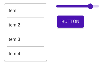
I've read the MD guide when created the material theme and created the styles according to it. In the official guide a Menu, a Slider and a Button looks like this:
And they look like this in LittelvGL by default: Code to reproduce: lv_theme_set_current(lv_theme_material_init(265, NULL));
lv_obj_t * obj = lv_list_create(lv_scr_act(), NULL);
lv_obj_set_width(obj, 150);
lv_obj_set_pos(obj, 20, 20);
lv_cont_set_fit2(obj, LV_FIT_NONE, LV_FIT_TIGHT);
lv_list_add_btn(obj, NULL, "Item 1");
lv_list_add_btn(obj, NULL, "Item 2");
lv_list_add_btn(obj, NULL, "Item 3");
lv_list_add_btn(obj, NULL, "Item 4");
obj = lv_slider_create(lv_scr_act(), NULL);
lv_obj_set_size(obj, 150, 20);
lv_obj_set_pos(obj, 200, 20);
obj = lv_btn_create(lv_scr_act(), NULL);
lv_btn_set_fit(obj, LV_FIT_TIGHT);
lv_obj_set_pos(obj, 200, 50);
obj = lv_label_create(obj, NULL);
lv_label_set_text(obj, "BUTTON");So I don't really know what the big problem is here. The user can give Material look to his UI with one line of code.
I'm sure that you are not interested in other themes, so just for completness: |


Problem is, that you think lot of minor differences are ok (probably, because you are not designer). But those form style, and final result is very "intermediate". It may be good for first "wow-effect", but that's not MD. If you have designer at your work - ask his/her opinion.
You can not follow style guide "partially". That's like with porting library - ported code should be exact, or it can not be named as port (because can not reuse existing docs and so on). Problem is not with custom application demands, but with not following style guide. My screenshots are universal for any applications without typing text. I strongly disagree with approach, when result should depend on library features. That replaces real goal with something unpredictable. IMHO correct approach is to implement exact style (with any kludges), and then consider how to organize it on second pass (extend api or something else). Evolutionary prototyping approach works very well for such kind of tasks. For example, first attempt can be without animation, without some nested things, but top level should be exact as in MD style guide. Then add more details and so on. |
|
I agree the details are important, however, to be honest, I'm happy with the current result and not planning to improve it now. If you feel these improvements are really important please update the theme as you wish and send a PR. |
Probability of this is low for 2 reasons:
So, i could do some fixes if more complete skeleton exists, or explain required changes, but i don't plan to be involved into more deep library development. The only constructive thing i could suggest in current situation - provide link to my app when it's ready. But i don't know how useful it will be, and that will be not soon. Anyway, i can not advice you how to spend your time. Let's try another things. We still have pending tail of task we can to together (compressed fonts and so on). |
|
You can simply copy the files of the settigns app to make some experiments in PIO if it's more convenient. Anyway, I have some other things to do now, but I haven't forgotten the font decompression. |
|
As the settings app is added I close this issue. Thank you very much for your contribution. |
How add icon? |

|
It's not supported now. |
|
Ok. Thanks. |
A lot of small embedded devices have interface like this:
IMHO it would save a lot of time, if everyone could take ready example, and copy-paste code with controls of required type.
What is expected from menu:
The text was updated successfully, but these errors were encountered: